
Given that more than half of website traffic now comes from mobile, it’s essential your website is fully optimised for mobile devices. If you want to continue reaching your customers, you’ll want to consider our guide to mobile-friendly websites.
What are mobile-friendly websites?

Mobile-friendly websites are websites designed to display flawlessly on smaller mobile screens. A mobile-friendly website will be optimised for an array of different screen sizes, ensuring that users don’t struggle to read your content and can easily navigate through your site.
Given the much smaller screen size, mobile devices will require a mobile-friendly website design for a better user experience. Mobile devices also won’t be able to handle more advanced features, such as advanced animations, which can lead to slow loading times and irritated users.
Does your site suffer from slow loading speeds? It could be time to consider a website redesign.
When it comes to designing websites for mobile, there are lots of terms that get thrown around (sometimes interchangeably). Terms such as mobile-friendly, mobile-first, responsive web design and adaptive web design are all terms you may have come across.
To clear things up, we’ll briefly cover what each of these terms means:
- Mobile-friendly – displaying a website on smaller mobile devices ensuring users can read and interact without readability or navigation difficulties.
- Mobile-first – a mobile-first web design is the design of a site with mobile devices in mind first. From the initial mobile design, designs are then created for larger screen sizes.
- Responsive website design – a single web design that will automatically respond and adjust the elements on a page according to screen size. Elements such as text, buttons and images are either resized or repositioned for a better mobile user experience.
- Adaptive website design – an adaptive design is a selection of various pre-made web design layouts accounting for different devices. When loading a page, a browser selects the best adaptive web design for a given device.
Why mobile friendly websites are important?
Mobile-friendly designs have become a necessity nowadays. Otherwise, you risk alienating and losing more than half of your website visitors. But the importance of mobile-friendly websites extends far beyond making your website widely accessible. Let’s take a look…
When it comes to designing websites for small screen sizes, there are 3 differences between mobile and desktop experiences. The 3 differences that need to be considered are:
- Minimum design space available
- Goal-oriented users seeking information or solutions relevant to a particular timely need
- Limited user attention due to increased distractions
An effective mobile-friendly design will account for these 3 differences. Otherwise, it can become difficult and complex for users leading to a poor user experience. Failing to consider these differences in your website could be driving customers away.
If that still hasn’t sold you on the importance of mobile-friendly websites, here are some stats and statistics that could.
- The number of people going online using their mobile devices has skyrocketed. In 2021, 88% of people went online using their mobile. In 2009, only 28% of people used their mobile to go online. Source: uSwitch
- The number of unique mobile phone users in 2022 was estimated at 5.48 billion globally, an increase of 3.2% from 2021. Source: Hootsuite
- Mobile devices account for 58.99% of global web traffic. Source: Statista
- 63% of searches on Google are performed on mobile devices. Source: Merkle
- Bounce rates for websites that are not mobile-friendly are often between 85 – 90%. Source: UserGuiding
- 90% of customers are more likely to repeat purchase from a company if they provide an excellent mobile experience. Source: Digital Examiner
- 80% of the top-ranking websites in Google are mobile-friendly. Source: IMPACT
- Search engines, such as Google, have now prioritised a mobile-first indexing approach. Ever since Mobilegeddon, mobile versions of a website are predominately crawled, indexed, and ranked as opposed to desktop. Source: Google
The benefits of a mobile-friendly website

Here are just some of the ways your business and website can benefit from a mobile-friendly website:
- Improved SEO and visibility in search results
- Better user experience
- Increased lead generation and sales
- Greater brand identity
- Faster site speed and increased time users spend on your site
- Streamlined experiences across devices
- Cost-effective and flexible web design
Tips for developing mobile-friendly websites

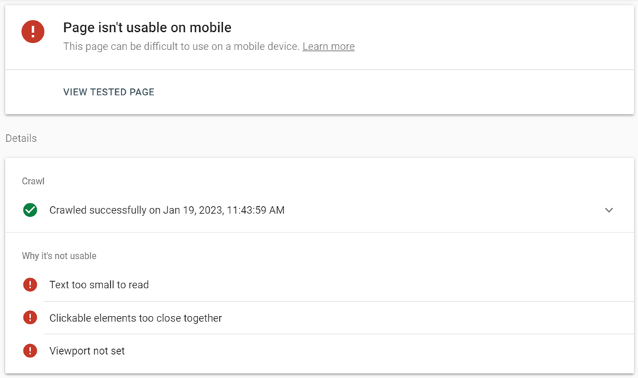
Check it first
Want to test how mobile-friendly your website is? Use Google’s mobile-friendly test tool and find out. If your website is not mobile-friendly, you’ll be provided with errors in the mobile usability report. You can also view a screenshot of how the Googlebot rendered the webpage.
Responsive web design
Many web design professionals will generally state that to create a mobile-friendly website, you should opt for a responsive web design. As we mentioned earlier, a responsive web design is a single design that adapts and displays well on both mobile and desktop devices.
A mobile responsive web design will adjust elements on smartphones and tablets, such as:
- Font size will increase to make it more readable
- Image size and positions will change and move according to the layout
- Call-to-action and button sizes will increase to make them easier to click (or tap)
- Overall layout to facilitate everything on a smaller screen
Unlike adaptive web designs, you’ll only need a single web design to display the same content and information on any device. With a responsive design, you’ll be allowing users to access your site without any content limitations. Not only that, but a responsive design can help your SEO too.
If you use WordPress CMS, responsive themes take care of the hard work for you. Consider themes such as Divi, Ultra, or Astra.
Optimise your speed
Speed and loading times are crucial first impressions on any website. If your site takes too long to load, expect people to leave. The longer it takes a site to load, the higher your bounce rate. Not only that, but high speed is also a positive ranking factor.
That’s why it’s increasingly important to increase your website speed. You can check the speed of a page using the PageSpeed Insights tool. Discover how to improve your page loading speed in 9 quick ways.
Avoid pop-ups
Pop-ups are a controversial subject for many users, often acting as an annoyance and obtrusion. Therefore, it stands to reason that pop-ups are a no go on mobile. They may work well (in rare cases) on desktop, but on mobile, they are best forgotten.
Never use Flash
In 2023, Flash should be long forgotten. Despite the issues and security problems it can cause, Flash does not run on mobile devices. Once popular, Flash allowed for interactive websites. So popular, it was estimated to be installed on 99% of computers. Even YouTube required flash for video playback.
But ever since the first iPhone launch that ditched support for Flash in 2007, its popularity started to wane. HTML 5 came along and removed any need for Flash entirely. Yet many old websites still make use of Flash. In today’s web design, Flash should be avoided like the plague. Flash should end up on the rubbish heap with Internet Explorer!
Optimise images
Images are a fundamental element of any successful web design. But when using images on a mobile-friendly website, you don’t need to upload them in a ridiculous HD size. Otherwise, it slows down your page speed while the images are downloaded and displayed.
Ideally, you should upload images with the same dimensions that you will add to your site. Find a balance between low file size and quality. Compressing images too much will affect the quality.
Clickable buttons
Clickable buttons or call-to-actions (CTA) are another essential component of mobile-friendly designs. Unlike desktop where people can click small links or buttons with the mouse, mobile requires clicking with your finger.
Placing clickable items too close together or too small makes it much more difficult for users to interact with your site. Make sure you use buttons that are big enough to be clicked within reach of the scroller’s thumb.
Simplicity over
Given that mobile screens are a lot smaller than desktop screens, there’s also less space for design. Trying to cram everything onto a web design for mobile just isn’t going to work. Your website will look cramped and overcrowded.
Instead, you should focus on incorporating the core elements of your website. Making sure you don’t provide every function on the same page will go a long way. Instead, offer the most important elements upfront, and leave the rest for the Hamburger button.
If your website isn’t mobile-friendly, now is the time to start changing that. Hopefully, our guide will provide a strong basis for helping you improve your website and user experience. And remember, always test your mobile-friendly website on a range of mobile devices.
Check out these 6 benefits of hiring a professional web design agency over in-house