![The psychology of colour in web design [free infographic]](https://dreamscapedesign.co.uk/wp-content/uploads/2022/01/man-g4db8d5589_19201-1.jpg)
Colour can make a real impact. The colour choices you make can have a strong influence on people’s emotions, even more so than the content. The same goes for the colours used in your website design. This is worth paying attention to, especially as a trend for websites in 2022 is more using colourful schemes.
The colour choices you make not only help to determine how people feel, but also how they will act. While your images, typography and other elements can help to make your site look professional, colour usage is what can really help to transform your design.
See 8 essential web design tips for your small business
To give you an idea of how important colour is in web design, consider these statistics. A user on a website will determine whether they like a website or product within 90 seconds, with colour being the most significant factor (up to 90%) in that decision.
Also, the use of colours can help increase your brand recognition by up to 80%. Whether it be your brand, marketing materials, or website, colour has a big role to play in improving your conversation rate. You are probably already familiar with the fact that different colours help to spark different feelings and emotions, right?
The same goes for colour use in web design. They are there to help elicit reactions, create feelings, and spark attitudes in your users. Each colour works to generate different responses. So, let’s look at how combining colour psychology and web design can help to increase action and generate sales on your website!
The psychology of colour in web design
Websites need to fulfil four main functions. They need to work (obviously!), allow easy navigation, provide valuable content that fulfils a user’s needs, and look good. Balancing these main functions helps to hold your user’s attention for as long as possible, while also helping to lead them from the attract stage to the delight stage.
Trying to influence user’s behaviour can be tricky as any marketer and web designer will know. That’s why understanding the psychology of colour in web design can help to create a potent tool in your arsenal to help influence a user’s behaviour. After all, there is more to colour than just being aesthetically pleasing.
But before we start to explore the psychology of different colours, let’s look at the slightly boring but equally important theory behind colour psychology.
How colour affects our brains
Colour is formed from the light that we see. You cannot have colour without light. Light contains many different colours, determined by the wavelength that is reflected from an object. White light is a mixture of colours, as traditionally seen by dispersing white light though a prism.
Each colour has a different frequency or wavelength (nm) that determines how we see that colour when objects either reflect or absorb different wavelengths. The shorter the wavelength, the more energy it feeds to your neural processing.
________________________________________________________________________________________
Longer wavelengths (nm)
Red 635-700nm
Orange 590-635nm
Yellow 565-590nm
Green 520-565nm
Cyan 500-525nm
Blue 450-500nm
Purple 380-450nm
Shorter wavelengths (nm)
_________________________________________________________________________________________
The human eye is only able to detect three colours: blue, green and red. Combining these colours together allows the human brain to perceive many different colours. These signals are seen through light sensitive cells in the retina at the back of the eye where a signal is then sent to the visual cortex of the brain, which allows images to be formed.
How the brain then reacts to these different colours depends on the chemicals that are released. For example, the brain reacts differently to blue and green light in the morning by releasing cortisol, helping us to stay awake. Reducing exposure to the same light frequencies at night helps us to feel tired through the release of melatonin.
Different colours are processed in different areas of the brain which helps to elicit different feelings and emotions. This makes colour one of the easiest visual elements to interpret resulting in our brains being able to read and decipher colours much quicker than text.
Do you start to see the importance of colour yet? Our brains are more likely to remember and create an association when colour is used. That’s why web designers and marketers spend considerable time focusing on the use of colours.
It provides a visual cue that helps guide your attention and make something stand out. Here are a few examples of how colour affects the brain:
- Green helps to improve focus for longer.
- Red increases our energy levels.
- Blue makes us feel more relaxed and calmer.
No matter where colour is used, whether it be clothing, food, advertising, or a website design, it can influence our decisions, performance, perceptions, behaviours, and influence our learning.
Use of colours in web design
Now we’ve looked at how colour affects the brain, it’s time to look at the use of colours in web design. As colours can elicit such strong emotions, getting the right colour in your design is a big issue.
Even the slightest of changes can make all the difference. To show you how, let’s put an idea into practice. You are presented with a call-to-action on a website. Have you considered what colour that call to action will be? Picking the right colour here can increase the click-through rate on that call-to-action.
Take a look at the examples below. Which would you be more likely to click on? The blue or the orange button?

Chances are it’s probably the orange button, right? Using orange or any other bright colour for a call-to-action can help stimulate attention and encourage an action. Blue or lighter colours, on the other hand, may have the opposite effect leaving a user feel more relaxed and less inclined to take action.
That is not to say go and make all your call-to-actions orange as it could clash with your current web design, particularly if you already have a design that reflects your brand. However, it goes to show how using warmer and brighter colours can help to elicit a desired action compared to using colder and duller colours.
See how you can find the right colour palette for your web design.
Let’s take another example. Look at the website examples below each featuring a different prominent colour in their design.
If you had to pick between the colours red, yellow, blue, or green for your website design, which would you go for? Which of these websites are you more likely to want to stay on for longer? Which website makes you want to engage with the content? (Clue: the answer is not the same for both questions).


The KitKat website (that utilises red) and the Postmark website (that employs yellow) are colours that will make a user more likely to want to engage with the content as they make you feel more active and energised.
In comparison, the Evolve Wealth website (using blue) and the Noodz website (using green) in their designs are more likely to see a user stay for longer due to the calming nature of the colour, which helps us to feel more relaxed.
Using brighter colours also has a difference between genders. Research has found that women can see colour better than males. In particular, research has shown that women are more drawn to brighter colours compared to males, but are more sensitive to subtle shades and patterns.
In fact, it is estimated that men are 16 times more likely to go coloured blind. Age also has an influence on the eyes responsiveness to colour too. Eyes gain a yellow cast as our eyes and vision grows more mature, resulting in colours tending to look more duller for older people. As a result, older people are more likely to prefer brighter tones.
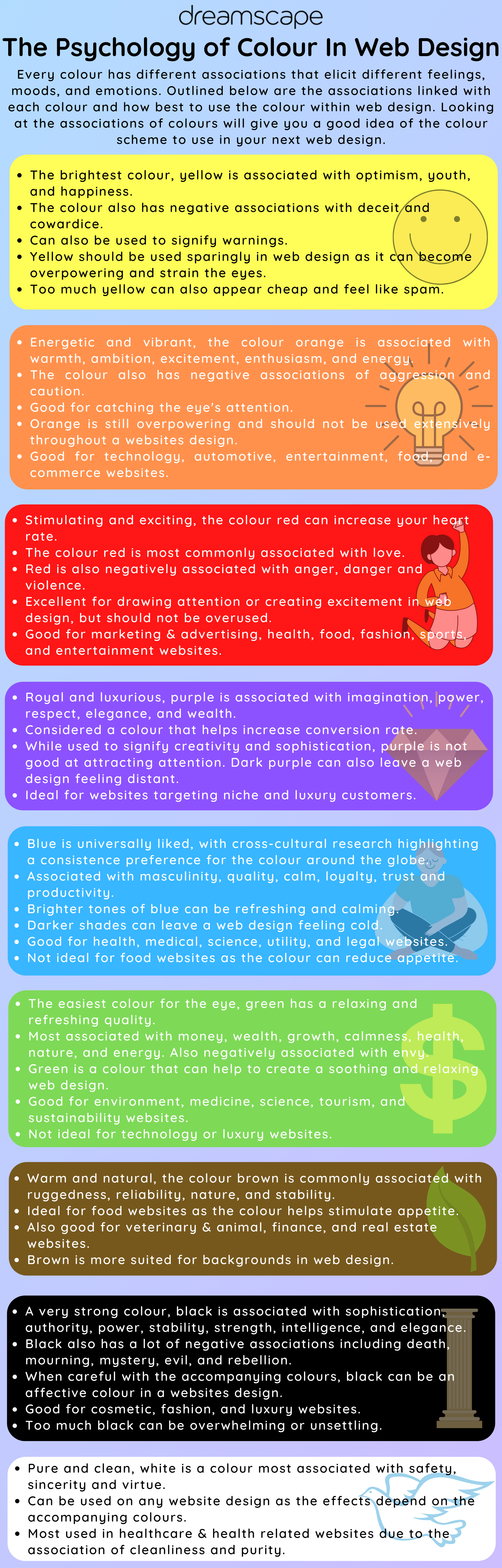
Colour associations & usage in web design infographic
So, the next time you consider a design for your website, remember the importance of colours and the associations linked with them. The psychology of colour in web design is not something many web designers will consider, despite the importance. Simply picking a colour you like best won’t cut it.
Using the right colours will make a world of difference for improving users’ perceptions of both your brand and website. Use of colours is especially important if you want to see that all important conversion rate increase too! Just remember to keep your customers in mind when designing your website.