The Evolution of Web Design

The Beginning of the World Wide Web (1991 – 1994)
If you’re part of the Millennial or Generation Z demographic, you could be forgiven for thinking that the web has been around about as long as cars, telephones, space shuttles or televisions. In fact, one of the most interesting things about the web is just how young it is, and how fast it grows, changes and develops. To be precise, the web as we know it is 27 years old. It was first proposed by Tim Bernes-Lee in 1989 and in 1991 the web was born with the first website going live.
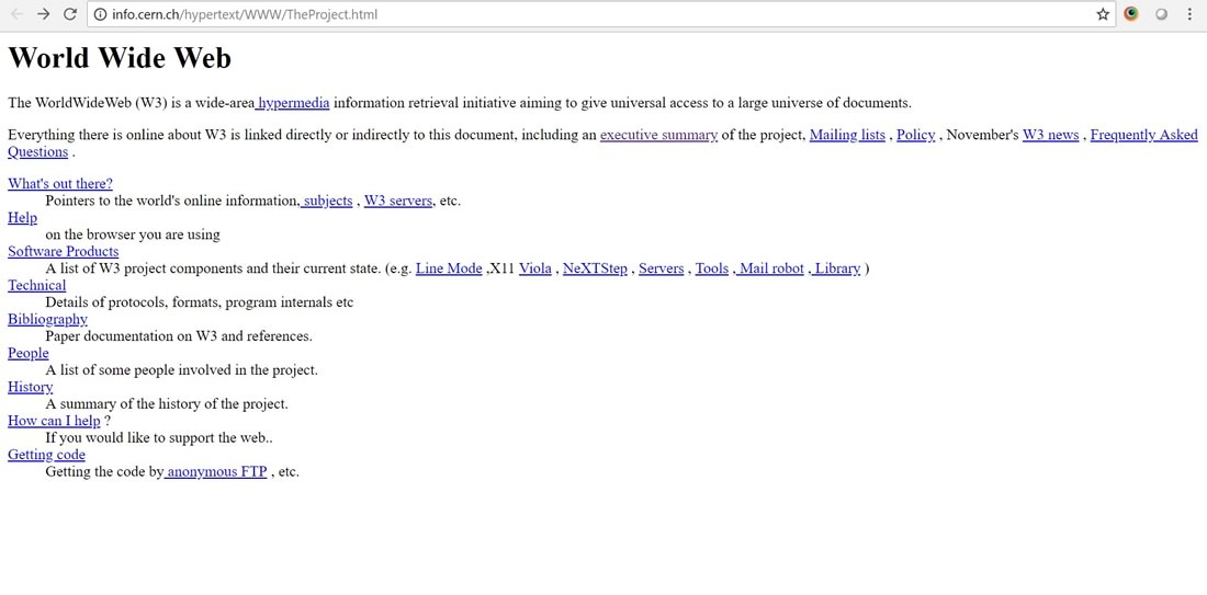
This first websites were completely text-based and required a text-based browser in order to view them. Nexus was the first web browser and was completely text-based. It wasn’t until 1993 when the web browser Mosaic was launched, that text and images could be displayed together on screen.
For those of you (like us) who are old enough to remember the dawn of the web, the name Netscape will surely need no introduction. Oh, those heady days in the 90’s when Netscape and Internet Explorer battled it out for the title of best browser! Well Netscape was the launched in 1994, and became the first browser to support on-the-fly page loading. It was a supremely powerful browser at the time and websites wore their “Best viewed in Netscape” badges with pride! Netscape has morphed over the years into the now popular and well-known Mozilla Firefox.
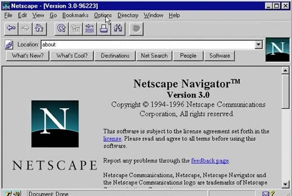
Image Source: Reddit
The launch of powerful browsing technology such as Netscape and later on Internet Explorer, meant that websites began to develop visually and started down the long road to the websites we see today.
Garish Animations, Bright Colours and Flash (1994 – 1998)

Amazon (1996), Source: The Internet Way Back Machine
The mid to late 90s is now frowned upon as an ugly era of web design, and compared to today’s websites, this is not far from the truth. But, this was also a hugely exciting era with new technologies, software and faster broadband speeds, being a web design agency during this time was like being a kid in a sweetshop. Web safe colours and web safe fonts were introduced. JavaScript was launched, allowing dynamic content and animations. The World Wide Web Consortium (W3C) was developing core principles and components, providing better support and easier access to the web. And, of course, Macromedia Flash was launched which promised huge creativity and design options for web designers. In fact, at one-point designers were hedging their bets on whether Flash would be the future of the web and sound the death knell for HTML.

BBC (1998), Source: The Internet Way Back Machine
Looking back at the 90s, I think we can all agree there were some monstrosities out there. But without this era, the web would not have developed into what we see today. Styles need to be tried and tested and, thankfully, this leads to improvements which we started to see towards the end of the 90s.
Structure and Order (1998 – 2002)
As we reached the end of the 90s, things began to calm down a bit. Designers started to realise that “less is more” and websites became a bit subtler. Designs were toned down and we generally started to see more structure and order within the designs, however there was still an over-use of blocky, garish colours. Flash was starting to become popular at this time, so it was not uncommon to find animated landing screens to which could test the patience of a saint.

Coca Cola (2001), Source: The Internet Way Back Machine
During this time with the greater emphasis on website structure, we saw more time devoted to website menus, navigation and page hierarchy.
A major bugbear from this era was the overuse of shadows and 3D bevels, particularly on menu items and buttons. This trend was instigated by the availability of new effects within graphics programmes, particularly Macromedia Fireworks and Adobe Photoshop.
Oh, and I almost forgot to mention – a small company known as Google was launched in 1998… you may have heard of them?
Innovation, Functionality and Social Media (2002 – 2006)
Towards the beginning of the new millennium, we saw a huge increase in innovation lead by increases in broadband speeds, and improvements in software and hardware. By 2003 over 50% of Internet users were accessing the web through 32bit hardware, enabling the display of over 16 thousand different colours. At the same time (between 2002 and 2005) the majority of users upscaled their resolutions from 800 by 600 to 1024 x 768. Together these changes lead to larger screen real estate and more dynamic designs being produced. Sadly, flash animations and flash intros were prominent during this time – Yes, I know… But at the time we thought they looked great!

Gabocorp (2002), Source: The Internet Way Back Machine
There were some major events during this time. Notably, the launch of YouTube in 2005, which was sharply purchased by Google one year later – The rest is history, as they say. 2003 also saw the launch of two other web giants – WordPress which now accounts for around 3/4s of all websites and Facebook which changed the face of social media forever. Although the launch of these well-known faces did not directly affect the web design trends at the time. They have definitely had an indirect affect. Facebook leading the way in terms of user experience (sometimes…) and spawning many similar style websites. And WordPress themes tend to be at the forefront of the latest design trends and styles.
Video, Mobile and HTML 5 (2006 – 2010)
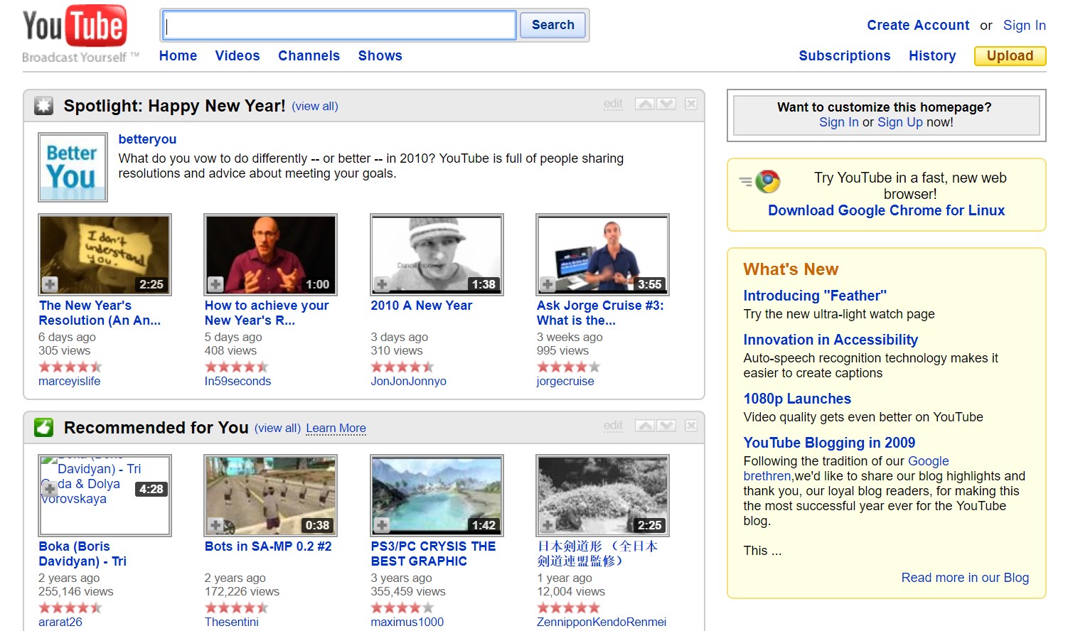
Youtube (2010), Source: The Internet Way Back Machine
The latter half of this decade was a really exciting time to be a web design agency. Already surrounded by quality software and hardware and a couple decades experience to boot, designers were having a field day refining the look and style of the web. Broadband was now getting seriously fast, social media was taking a large chunk out of peoples’ lives, and video streaming services were on the rise. All that aside, the biggest change was just around the corner – design for mobile. With the launch of the iPhone in 2007 the way we interact with our phones changed forever. Until then it was inconceivable to spend considerable time browsing websites on mobile devices. The user experience was far too frustrating and websites were just not built to accommodate this… yet.
Towards the end of this decade web designers were starting to think about the mobile web, but it was in the form of separate mobile websites. Fluid layouts for different screen sizes were being talked about in certain circles, but it wasn’t until 2010 that Ethan Marcotte coined the term “Responsive Web Design”. This will of course play a massive part in fundamentally changing the web as we know it, in the decade which follows.
Responsive Web Design, Parallax Scrolling & Retina Screens (2010 – 2014)
At the beginning of this decade we saw a rapid rise in mobile usage and this had a major effect on web design, both aesthetically and functionally. In 2010 people started to experiment with responsive design and in 2013 Mashable officially labelled it “the year of Responsive Web Design”. By 2014 it was no longer considered an optional extra to have a mobile website, it was now the norm. If a design agency didn’t include responsive design as part of your project, they weren’t going to be around for long.
During this time, we started to see longer web pages with vertical scrolling, centralised content and large screen-filled images. Mobile web browsing meant that people were becoming accustomed to scrolling once again, and this also encouraged simplicity in design. Websites were becoming more minimalist to cater for smaller screens, and the structure of content was being given far more thought than previously. The use of large background images behind text content led to parallax scrolling which provides subtle depth to an otherwise flat design.
The introduction of retina screens (first on mobiles and tablets, and later on laptops), also influenced the design process. It was no longer acceptable to integrate images at the correct pixel size, they now needed to be 1.5 to 2 times larger to appear crisp on these displays. At first this was an inconvenience for designers, but we soon realised that by using larger images and CSS to reduce the size on screen, we could make the images look super-sharp, adding vibrancy to our designs.
The Here and Now (2014 – 2018)
So, that leads us to the last four years… During this time responsive web design has become common-place and mobile-first design has become a popular methodology applied by many agencies. Growing browser support for CSS3 and HTML5 has given web designers a creative ‘shot in the arm’, allowing on-screen animations and effects previously only deliverable using JavaScript.
One of the most noteworthy trends in the last couple of years was the rise in mobile web browsing, overtaking desktop and laptop usage. This has in turn led to Google prioritising the mobile search results, and ranking sites higher if they are fast and mobile-friendly. In fact, Google is now using the mobile results as the primary search listings, which highlights the direction web browsing is heading in.
With the trend in mobile web usage we have continued to see a simplification of websites in terms of design and structure. Fast, clean, bold type and strong colour schemes are all styles that are now commonplace. And with inbound marketing becoming a popular methodology, we are now seeing an increase in landing page design as a key part of organisations’ website strategy.

Growth-Driven Web Design
This leads us to one of the most significant shifts in the last 20 years, the rise of Growth-Driven Web Design. It took us a while, but after 20 years of designing websites, it became clear that traditional websites just don’t perform very well. There are a few exceptions to the rule of course, but unless you have a mighty marketing budget, your chances of success are pretty low. I don’t mean to put a dampener on things, but the truth is traditional web design does not deliver the results businesses need. And this leads to a lack of confidence in the industry and a reluctance to assign a significant budget to the website process.
So what is Growth-Driven Web Design and how does it solve this problem?
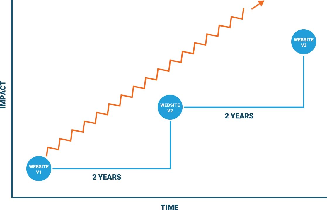
Growth-Driven Design is a scientific approach to web design. It involves analysing user behaviour and using real data to create web pages that will generate qualified leads and convert those leads into customers. With traditional web design a website is built and then forgotten about until it’s time for a redesign, which could be anywhere between 2 and 5 years. The Growth-Driven Design methodology focuses on strategy and continuous improvement. This, over time, enhances user experience, eliminates frustrations and removes bottlenecks, and increases conversions and sales.
The Steps Involved in the Growth-Driven Design Process
The Growth-Driven Design process comprises of 3 clear stages – The Strategy Phase, The Launchpad Phase and the Continuous Improvement Phase.
- Strategy:
The strategy phase is the initial stage in the process and is also the most important. It is essential to get this stage right in order for the process to be successful. It involves getting to know the business inside out – What are their goals? What are their pain points? Who are their buyer personas and what do they want from the website? How will the website achieve these goals? This will involve speaking with managers and employees in each department within the business, analysing user analytics and heatmap data, and interviewing customers. This phase will culminate with the construction of a Strategy document outlining the website goals and the processes that will be implemented to achieve them. - Launchpad:
The launchpad phase involves the construction of the initial launchpad website. The goal of this is to launch a website which will look and perform better than the current site, but is not the final product. Instead it will act as a foundation for all improvements and enhancements to be built upon. By using this methodology the website can be developed and launched much quicker than with traditional web design, and you can start measuring and improving as soon as the website goes live. - Continuous Improvement
The continuous improvement phase starts after the launchpad phase. Once the website is live and collecting user data, you can start making improvements, enhancements and optimisations based on data-driven research. This stage (as the name suggests) is a continuous process and is what really differentiates growth-driven design from traditional ‘set and forget’ methods. A wish-list of goals are identified and prioritised into the continuous improvement cycle, leading to repeatable and scalable growth for your business.
Is Growth-Driven Design the Future of Web Design?
As tools measuring user experience become more prevalent, it makes sense that this data will take a leading role in the construction of web interfaces. After all, happy website users become happy customers and happy customers become advocates for your brand. There is nothing more valuable to your business than positive word of mouth. In an age when trust in corporations is at an all-time low, people now want advice from their friends and family, not from a high paid sales rep. Growth-driven web design is built on the inbound methodology of attracting, engaging and delighting your website visitors. By making continuous improvements to the website experience, you can attract more qualified leads, acquire more customers and increase sales.