
In our last blog post (Web Design Trends of 2017 – Part 1) we discussed some of the major web design trends of 2017 so far. This included mobile-first and responsive design due to the rise in mobile web usage, photography and video playing a more prominent role, VR technology taking its first baby-steps onto the web, and the growing of popularity grid / card layouts. In part 2 we will be looking at some of the other web design trends which are set to define 2017.
Parallax Scrolling
Parallax scrolling was a popular 2016 trend, but it has continued to grow during 2017 with designers getting more savvy with its usage. Whilst it was originally used to provide a layered effect to the “flat” screen, it is now being used in subtle and clever ways, bringing the focus to key content areas as you scroll. A great example of this is Myriad
Using a fantastic minimalist style, images and content are delivered from the left and right as you scroll down the page. This really adds to the user experience whilst also encouraging you to watch closely to the visuals. The clever use of parallax scrolling on this site oozes style and sophistication.
Another fantastic use of parallax scrolling is Firewatch.

The scene is made up of various layers each of which move at different speeds to provide a real sense of perspective and depth as you scroll down the page.
Be wary though, there is a tendency to make parallax scrolling single page websites, which can have an adverse effect on your SEO. It is always best practice to have multiple pages and focus each page on a single topic or key phrase.
More Exciting Colour Schemes
Since the adoption of the mobile web we have seen a simplification of websites, in order to cater for multiple devices. However, one area that is moving in the opposite direction is the use of bold colour schemes. During the last few years web design has been dominated by minimalist styles and muted colours, with bold colours and gradients frowned upon. This is all starting to change, with designers using bold colours to add personality to their otherwise stripped down designs.
An example of a bright and bold colour scheme is Asana which uses a combination of striking colours and gradients throughout the design. Whilst having the potential to be garish the colours actually work very well together, providing a bright and welcoming interface.

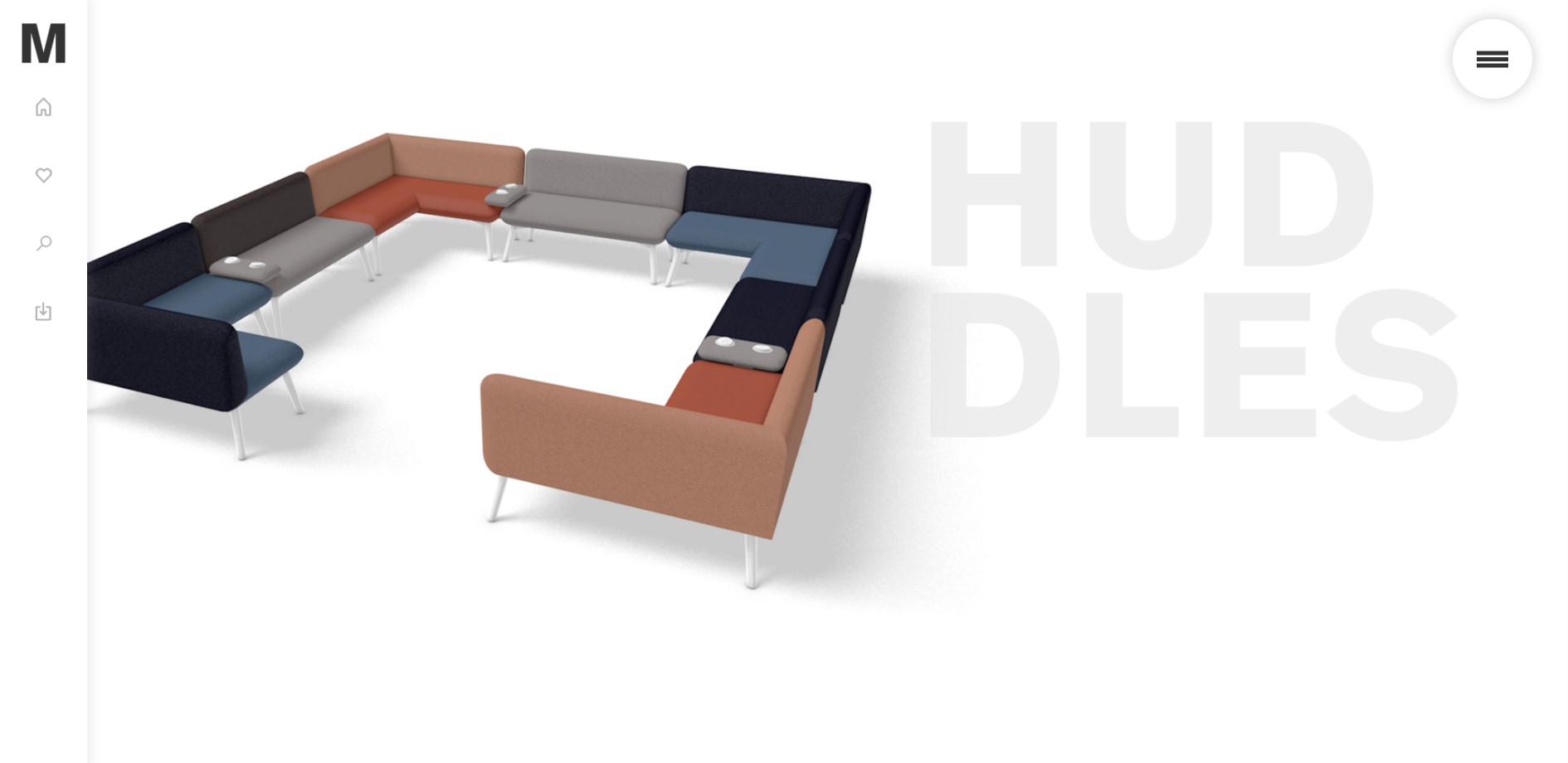
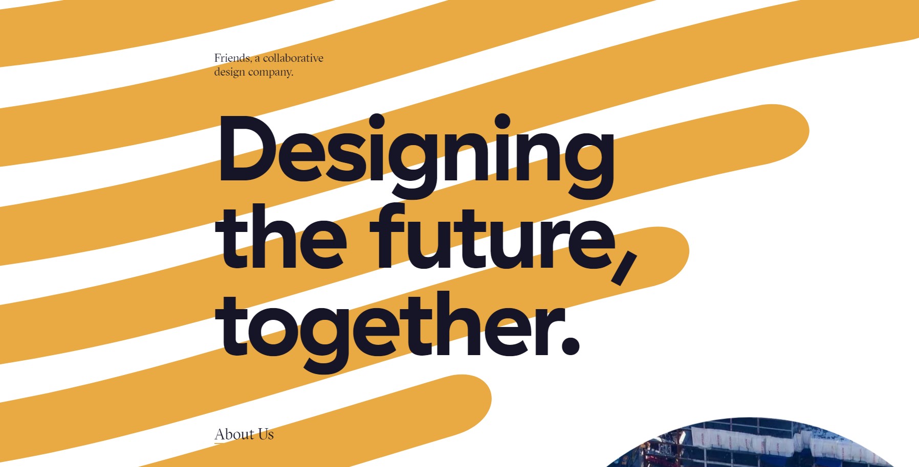
Big, Bold Fonts
Any graphic designer will tell you the importance of typography within design, but due to font support (or the lack of) the web has been slow to catch on to this. Designers are now experimenting with larger, bolder typography, breaking the grid structure. When used along with parallax scrolling this can be extremely powerful.
A great example of this is BFF. Friends (a design agency in the US) use large fonts as a centerpiece in order to focus on their brand message.
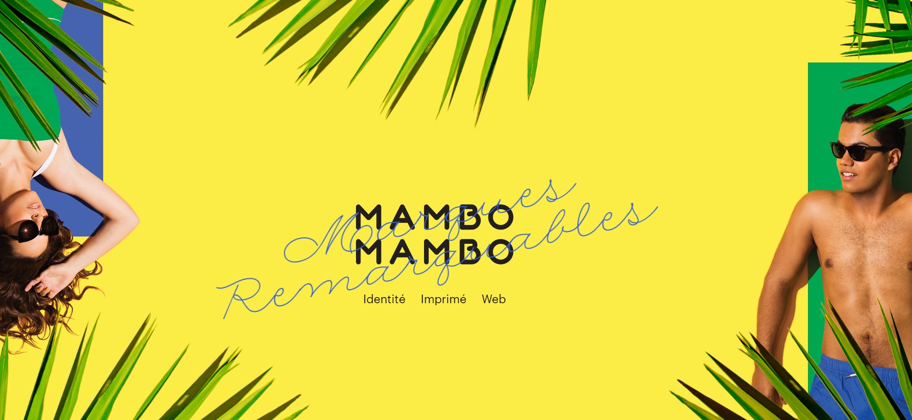
More Animations
The days of Flash animated splash screens are gone (thank goodness!), but expect to see a lot more animations on the web throughout 2017. These animations will be used to enhance brand stories and engage users, adding personality to otherwise static web pages. Thanks to the development of and browser support for HTML5, CSS and JavaScript animated content is going to play a much large role in our web experience.
Mambomambo’s website is a great example of subtle animation used for engagement.
Another great example is Space Advisor which uses striking animated images whilst taking you on an interactive tour of our solar system.

Broken Grid Layouts
The mobile web has brought about a simplification of websites and this in turn has led to increased conformity across the web. This has led to a debate within the design industry about web design losing its soul. To counter this designers are trying to find new ways to innovate whilst maintaining the cross-device methodology. One way of doing this is to break out of the uniform grid layout which we see on so many websites. This can be achieved by overlapping elements creating a layered effect, seemingly random placing of elements in seemingly random positions, or displaying text content at an angle instead of straight lines.
A good example of this is Trippeo – which displays a floating navigation area in the centre of the screen, clicking on which scrolls you down the page to the various sections.
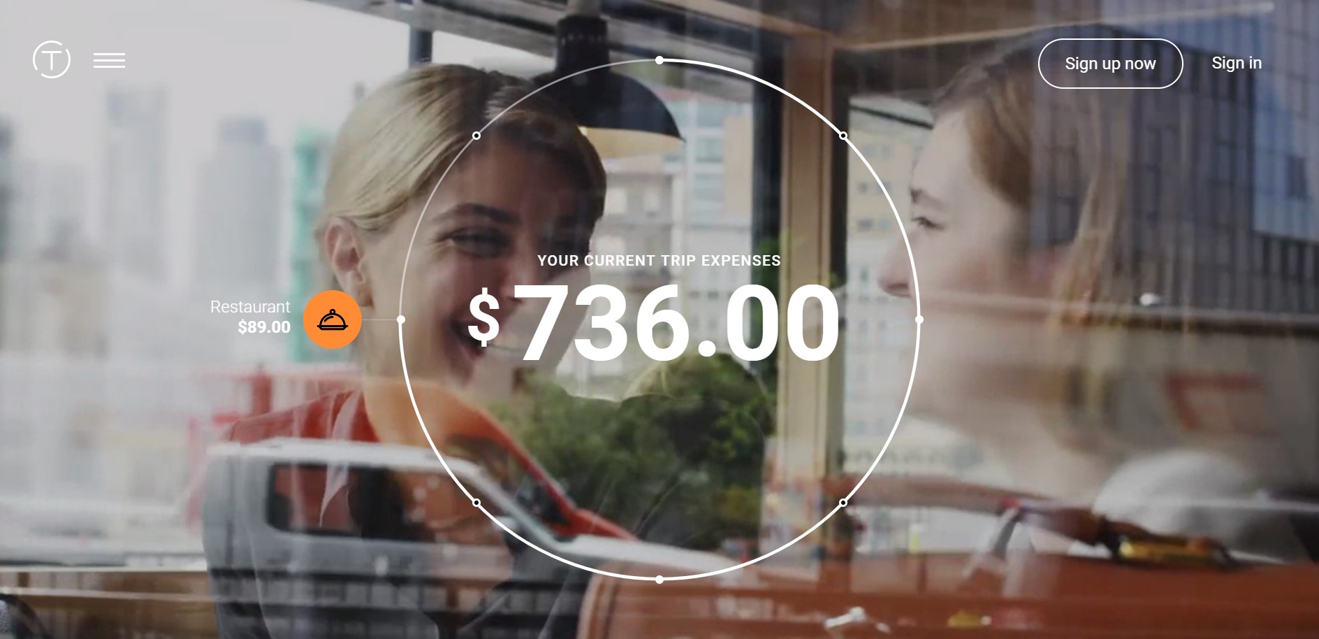
More focus on conversion
We started to see a much greater emphasis on website conversion during 2016 and expect this to continue throughout 2017 and beyond. Websites can no longer just look the part, they now need to pay their way by converting visitors into customers. There is a lot of theory behind this trend, with many web agencies providing conversion rate optimisation services which include the implementation of landing pages, A/B testing, user segmentation, cart abandonment analysis and more. By implementing these processes the aim is to maximise conversions and turn your website into a slick machine.

By creating “call to actions” and “landing pages” you can lead your potential customers to provide you with their details, enabling you to build a relationship which you can nurture over time.

But remember, in order to entice a customer, you need to offer them something of value. This will vary from industry to industry but eBooks, checklists, or even a free trial or product is a great place to start.
Further Information – The Evolution of Web Design
Whether you’re a business based in Coventry, London, Bognor Regis or John-o-Groats, you too can benefit from keeping up with the latest web design trends. The age-old business rule of staying one step ahead of your competition still applies. Give us a call on 024 7610 0380 and find out how we can help your business to take advantage of these new and exciting trends.