A website’s design is an important aspect of your business’s online presence. That’s why it’s important to get a well-designed website that will make the right impact. It is estimated that around 66% of web users would prefer to see a website that is visually attractive and well-designed compared to a website that is not.
Small businesses are no exception to the importance of a well-designed website. In fact, smaller businesses may need to try harder to create a visually attractive website that helps make that first impression of your brand even more meaningful. A poorly designed website and you are off to a bad start. A bad start that may be very difficult to put right. No pressure there then!!
As smaller businesses may not be able to afford the services of a professional web designer, there are some essential tips that can get you off to a good start when creating your website. Here are 8 web design tips for small business.
8 essential web design tips for small business
The design and layout of your site is just as important as the content. 38% of users will stop engaging with your website if the layout and content is unappealing. Especially when an impression of your site can be made in just a few seconds!
Here are a few reasons why you should create a good design for your site:
- Boost your search engine optimisation strategy
- Build trust and creates consistency
- Stand out from competitors
- Improves useability and navigation
- Reduces bounce rate
- Increases user experience (UX)
- Improves conversions
Now that we’ve highlighted why you need a well-designed website, let’s get into the nitty-gritty of how you can create a first-class design with these web design tips for small business:
Web design tip 1: Easy navigation
Making your site easy to navigate is perhaps one of the most important elements to creating a well-designed website. Most people visit a site with a purpose in mind. If people cannot easily navigate your site and find the content they are looking for, they will leave and visit a competitor’s site instead.
Users will not spend ages searching for content. Improving the navigation of your site helps to make it easier for users to fulfil their needs and find what they are looking for. Creating a clear and self-explanatory navigation will help to boost UX, help in creating a responsive web design to boost SEO, and increase the likelihood of them returning in the future.
To help improve navigation, consider implementing a navigation menu or bar. A navigation bar is a row (or sometimes a column) of links that acts as a central point to lead users to certain sections of a website.

As people scan webpages from top to bottom, and left to right, the navigation bar should be one of the first things people see on your site. Therefore, your navigation bar should be right where people will see it – at the top. The links in the navigation bar should also go from left to right too.
But there’s more. Filling your navigation bar with lots of different navigational links only creates unnecessary clutter. Simplicity is best when incorporating a menu. Use broad headings that groups content together. Use no more than 5 broad heading links on your navigational bar. Then, using dropdowns, you can include related subheadings.
A content hierarchy, which favours more important and broader information first, will help you to determine how best to strategically arrange the navigation bar.
Web design tip 2: Pick a design that reflect your business
Using a design that reflects your business, what it stands for and the personality of your brand really helps to increase brand awareness and recognition. When choosing a design that reflects your business, you should consider the font and typography, graphics and imagery, and the colour scheme. All of these should match your brand and brand personality.
Industries can also have an influence on colour choice.

Creating a design that is in line with your brand will help to increase the number of conversions further down the line. While the first visit may not lead to many conversions, a user will form a judgement and impression of your brand. When the time comes for that lead to convert, you want the user will remember your brand. Even more reason why creating a strong first impression is essential when creating your website design.
While it is important to match the design of your website to your brand, you should also consider your customers too. From developing a customer persona, you will know certain characteristics and preferences that you should consider within your design.
Web design tip 3: Consistency across all pages
As with picking a design that reflects your business, you also want to create a design that is consistent across all your pages. Consistency in your web design involves making sure all the vital elements that are repeated throughout pages are the same. Creating a consistent design across all your pages not only helps in building credibility but also increases the trust a user has towards your brand and site.
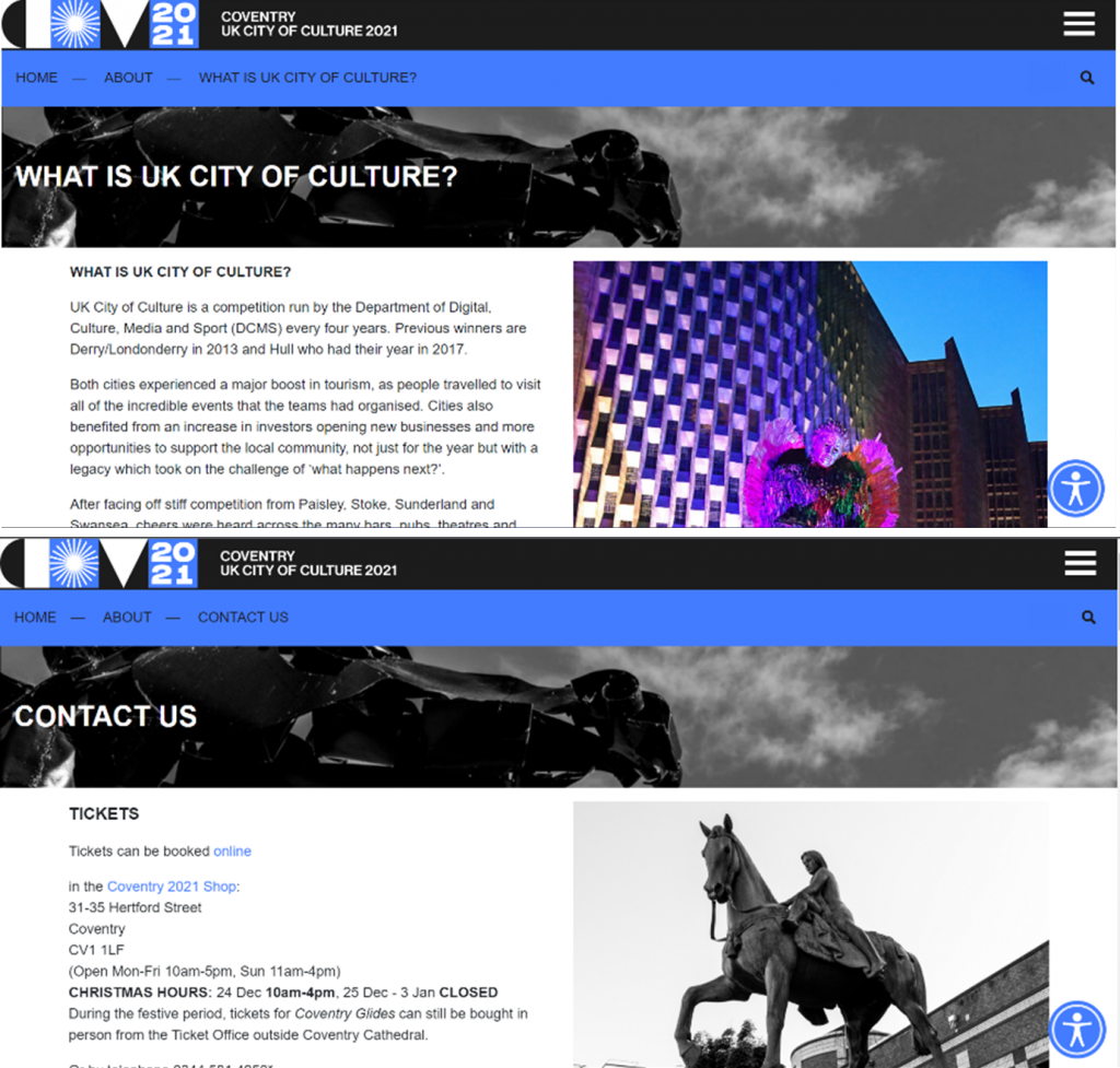
The Coventry City of Culture websites design is consistent, including placement of test, images, and the navigation banner.
All the elements that are repeated across each of the pages should be the same. The placement of the logo and navigational bar should also be the same across all pages as part of the consistent design.
To help create consistency in your design across all pages, consider applying global CSS. Cascading Style Sheets (CSS) is a style sheet language used in websites that determine how HTML elements should be displayed. By applying the CSS globally you can ensure that each element is consistent across all pages. Alternatively, some Content Management Systems (CMS) have pre-set designs (themes) that you could make use of.
Web design tip 4: Relevant and meaningful imagery
Incorporating imagery into your website design is one way to help make your content more appealing and engaging. Without images and videos, websites will look bland and uninteresting and may put people off reading your content. Conversely, too many images and videos will make your web pages look cluttered and overwhelming, again putting people off. No matter how good the content may be, people won’t stay if doesn’t look appealing.
When incorporating imagery onto your webpages, ensure they are relevant to the content of the page and that they add to the written content (not take away from it). Finding a balance between text and imagery can be difficult. Try using images that are relevant and that fulfil a purpose. Adding images for the sake of it is a big web design mistake.
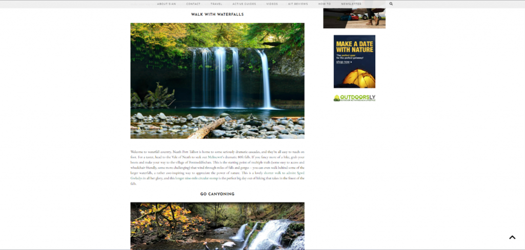
The Girl Outdoors blog makes effective use of balancing images and text.
Instead, consider incorporating images that support the written content. Pictures, graphics, and infographics can convey information much quicker than written text. Use them to break up copy, add emphasis, or condense text. Videos are also a good way to show value to users and can quickly communicate information.
Web design tip 5: Call-to-actions
Call-to-actions (CTA) are used to lead users of a webpage to perform or complete a specific action. These can be used for many reasons, including to download a piece of content, sign up for a newsletter or register interest in a product or service.
If a potential lead likes what they see on your site, they may want to take that next step towards becoming a customer. Providing CTAs will guide potential leads towards that next step. Without providing CTAs you could lose a valuable lead.

Where you place your CTAs is also very important. Providing just one CTA at the top of page may be insufficient as the lead may not be ready to progress at that point. Consider including multiple CTAs at various points throughout your content. Just remember to make them stand out and keep the design consistent with the rest of your site.
Check out the 5 best practices to improve conversions.
Web design tip 6: Fast page speeds
When incorporating many different elements onto your pages, including images and embedded content, the page speed can suffer. The longer it takes for your website to load, the greater your bounce rate (a percentage of how many users left your site after just viewing one page) will be.
Optimising your content can help to minimise the page speed and boost your search engine optimisation. Try to minimise the number of animations, heavy reliance of graphics, reduce the file size of images used and minify your HTML, CSS, and JavaScript to cut down your loading speed.
Check the speed of your site using Google’s PageSpeed Insights.
Web design tip 7: Optimise for mobile
Mobile devices now account for more than half of the web traffic worldwide. It is estimated that in the first quarter of 2021, mobile devices accounted for 54.8% of web traffic. Yet around 90% of small business don’t consider mobile devices when creating their website.
With so many users now accessing the web through their mobile devices, not optimising your website for mobile is a big mistake. You’ve heard it from us before when we shared 5 web design secrets, but when designing your website, consider starting with a mobile-first methodology. Once you have developed a website that works well on mobile, you can start to develop it for desktop sites.
Web design tip 8: Balance between white space and content
A well-balanced website design will find the perfect equilibrium between text, images, and whitespace. We have already outlined how using relevant and meaningful imagery can help improve the design of your website in tip 4. Taking it a step further, the amount of whitespace can also have a positive impact on your web design.
Whitespace is the equivalent of letting your website breath. It is the space between content that’s left blank to help break-up your content. Flooding your pages full of content, whether it be text, images, adverts, etc., will do nothing but overwhelm users and create a negative UX (it could also radically decrease the speed of your site too).
The FadeIn website makes use of whitespace around the page and in-between the content to help the content ‘breath’ and make it more appealing to read.
That is not to say leave great spaces of your website blank. Consider how minimalist designs (a web design style we picked out for 2022) can sometimes have greater impact with your content, as it can make help key content to stand out within your homepage. Remember, whitespace isn’t wasted space.
Following these 8 essential web design tips for small business will help to increase the UX of your website and build successful, long-term relationships with your customers. As a bonus, a well-designed website also helps to improve your SEO. If you want to find out more about the web design tips for small business outlined above or how we can help in optimising your website design, get in touch for a friendly chat.


