As we near the half way point in 2017, it is the perfect time to look at which web design trends will be defining this year. There are many factors that affect web design trends. One of the most influential is the shift in web usage, from computer, to multiple devices – mobile, tablets, gaming consoles, televisions. This has changed the playing field for designers and developers who are no longer confined to a fixed-size display, but now must design for a variety of devices and screen sizes. Technological advancements also play a very large part in influencing trends, as the Internet of things hits the market and virtual reality hits our screens, we can expect bigger and bolder changes in months and years to come.
Mobile First
Mobile Internet usage has sky rocketed in the last year, now officially taking over from desktop and laptop usage, which has necessitated a rethink to the traditional approach to web design. Traditionally websites were designed first and foremost for computer screens, with a mobile version being put together often as an after-thought. But this approach won’t cut the mustard anymore folks! Unless you want to alienate half of your user-base, you need to be thinking about the mobile experience from day 1, which is where the mobile first methodology comes in.
“Mobile first” means, literally, to design for the mobile first. This is advantageous to the whole web design process, as it forces the designer to think about which elements are absolutely necessary for the user experience, and which are superfluous. It means going back to basics, starting with clean slate, and working the design up, adding elements to enhance the experience and not to meet the latest design craze. This also encourages a more refined approach when it comes to designing for larger screens. By applying a “less is more” mentality it can really benefit the website users and allow your content to breathe.
Responsive Design
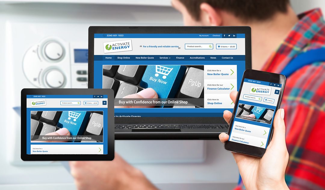
Responsive design? That’s not new! I hear you say. OK, responsive web design has been around for a good few years. But it’s worth mentioning that this is likely to be the year responsive design becomes not just a fancy trend, but an absolute necessity for your website. This will be the year that responsive web design becomes common-place within the web design industry, and any design agency not providing this as standard, will be left by the wayside.
The battle between “responsive website” and “separate mobile version” (which has been raging over the last few years) has finally come to a head with “responsive web design” being crowned champion. Google scored the winning goal for responsive design by stating that this is their preferred method of mobile web rendering.
So what is responsive design? In a nut shell, a responsive design is a website that adjusts according to different screen sizes allowing optimum viewing on all devices. This is achieved by using CSS media queries to detect screen sizes / resolutions and flexible layouts to reposition elements and layouts according to each device.
It is now more important than ever to have a responsive website, with Google prioritising this as a ranking signal within its mobile index.
Authentic Photography
Years of regurgitated stock photos has finally taken its toll and we are now seeing a resurgence in authentic and unique photography, particularly with the larger brands. We all remember the boom in stock photography sites a few years ago, and to be fair, they have served us and continue to serve us well, particularly for the smaller businesses on a limited budget.
The truth is that photography has become increasingly important within web design. With sites leaning more towards minimal design, the focus has shifted to what is on the pages. This means content has once again become “king” and your photos are a key part of this content.
Commissioning a professional photographer to create a unique set of photos for your business is a fantastic way to stand out from the crowd, giving you full control over your visual brand image, and allowing you to keep away from those pesky, repetitive stock photos!
Video
Video have been around on the web for a long time, but until recently limits in broadband speeds and technology meant they were a luxury rather than the norm. Improvements in broadband speed means that we are going to continue to see a lot more video on the web.
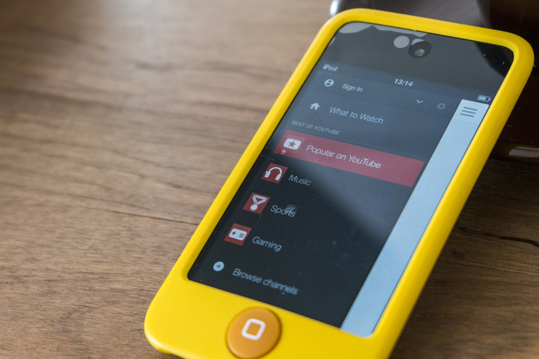
This trend is encouraged by sites such as YouTube and Vimeo, allowing videos to be easily embedded on your site, and HTML5 video support means it is now much easier to host and stream your own videos.
The following stats from HubSpot show why video is now such an important marketing tool all brands should be making the most of:
- After watching a video 64% of users are more likely to buy a product online
- Including video on a landing page can increase conversion by 80%
- Real estate listings that include a video receive 403% more enquiries than those without
- 1/3 of all online activity is spent watching video
More recent data from HubSpot shows that this trend is continuing into 2017 and will continue, making video an essential marketing tool for your business.
Virtual Reality (VR)
VR is still in its infancy, but the recent development of VR headsets for the gaming and media industries such as Oculus and Sony suggest that this is an area that will continue to develop. There is huge potential for brands to explore this new technology and many brands are already creating interactive VR experiences.
Check out this video for examples of the best uses of VR in marketing.
Most of the current VR marketing examples are app-based but this is already starting to translate to browsers. The future of VR as a web-based marketing tool is almost upon us as a number of companies such as Sketchfab develop the technology to create and share VR content on the web.
Grid / Card Layouts
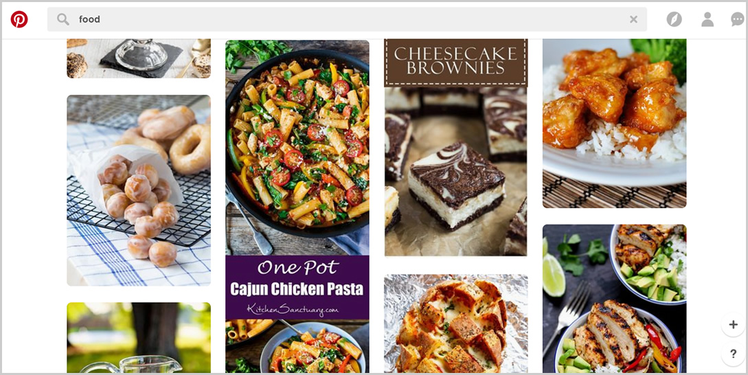
Grid and card layouts are becoming really popular on the web and are a fantastic way to organise content in a simple, structured way. First introduced by Pinterest, the use of content “cards” allow text, images, video, etc. to be easily organised and navigated by the user.
The reason cards work so well is due to their simplicity. They are easy to understand and navigate, and they work perfectly with responsive and mobile-first methodology, repositioning themselves easily on smaller screens.
Great examples websites with good use of grid / card layout include:
Further Information – The Evolution of Web Design
Businesses all over the UK from Coventry to London, Bognor Regis to John O’Groats, can all benefit from keeping up with the latest web design trends. The age-old business rule of staying one step ahead of your competition still applies. So why not give us a call on 024 7610 0380 to find out how your business can take advantage of these new and exciting trends.
More coming up in Web Design Trends for 2017 (Part 2) very soon!


